Intro
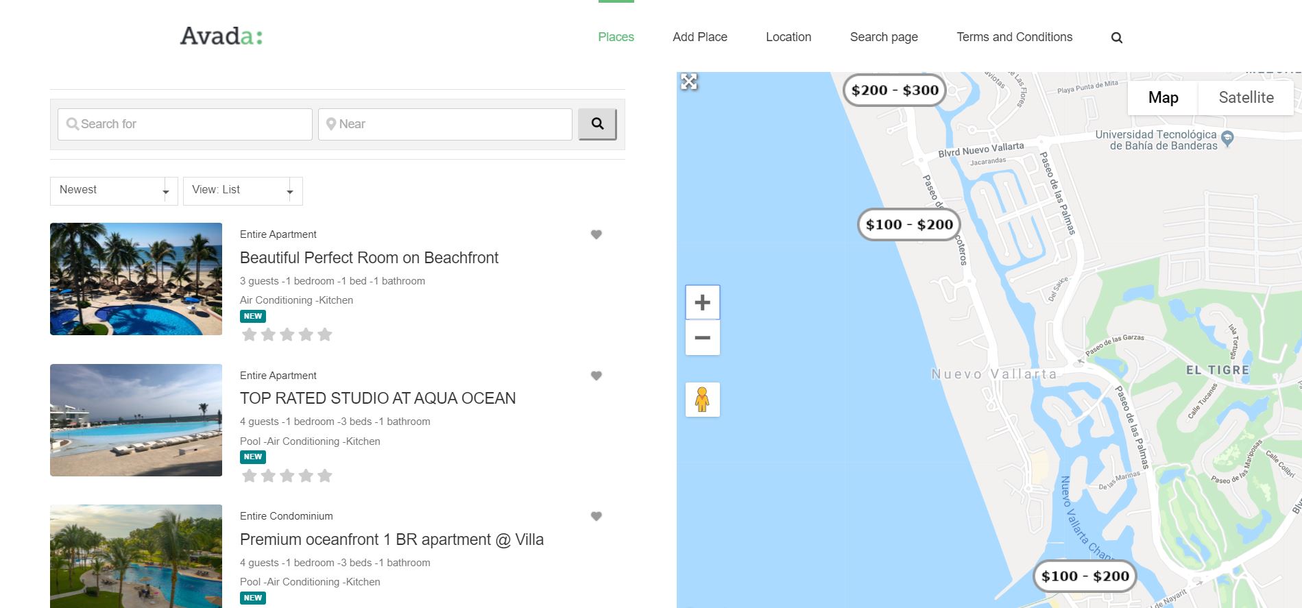
After setting up my sticky sidebar column in GeoDirectory, it looked great on desktop.
But when I checked on mobile, things broke — instead of stacking nicely under the main content, the sidebar turned into a slim, squished column.
Here’s how I fixed it.
Problem
On desktop: sidebar = 25% width, content = 75%.
On mobile: sidebar stayed at 25%, instead of expanding to 100%. This caused an ugly layout.
Solution
The trick is to use Blockstrap’s responsive column widths.
- Select the parent columns in Blockstrap editor.
- In Column Width settings:
- On Desktop:
- Left content column = 3/12 (25%).
- Right sidebar column = 9/12 (75%).
- On Mobile:
- Both columns = 12/12 (full width).
- On Desktop:
- For the child sticky column inside, always keep it at 12/12 (100% of parent).
Use the device selector in the column width settings to apply different widths per device.
Extra Notes
- This is one of those small Blockstrap features I didn’t realize existed — you can toggle between desktop, tablet, and mobile column widths right in the editor.
- Once I set them, the sticky sidebar stacked perfectly under the content on mobile.
Conclusion
Sticky sidebars don’t have to break your responsive layout. Just set column widths per device (desktop vs. mobile) in Blockstrap, and your design will look great everywhere.

Leave a Reply